
2025
Merge Millions
Redesigning the building-selection screen of Harvest Hustle, a merge-collection feature inside Cashman Casino.
UX Analysis
UI Design
Design Leadership
Product Overview
“One screen was carrying the entire progression of a merge feature, and players couldn’t read it at a glance.
The challenge was to make the whole system obvious without breaking anything that already worked.”
Craft, clarity, and a plan to ship it
Merge Millions brings casual merge-collection mechanics to the social casino genre. Players merge items to earn stars, stars upgrade buildings, and completing every building unlocks the big milestone rewards. The building selection screen is where players are supposed to read that whole system at once, seven buildings, three star levels each, and know exactly what to do next.
The brief asked for three things: analyze this screen, deliver a polished redesign in the exact visual style of the feature, and plan the team and timeline to build it. I approached it the way a lead does. Diagnose first, then propose, then organize the work to get it made.

0+
0+
Screens Studied
Mapping the Live Feature
0
0
Progression States
7 buildings across 3 star levels
0
0
Roles Orchestrated
UX, UI, Game Artist, Animator
Screen Analysis
Before touching pixels, I mapped what the screen has to do, then every place it fails to do it.
Three jobs, one screen
The screen has to show the system overview, seven buildings by three star levels, always visible and consistent. It has to guide progression, the current status of each building and the exact condition to unlock the next one, with no ambiguity. And it has to motivate, surfacing the milestone prizes for completing everything as a reason to keep going.
Where the hierarchy breaks
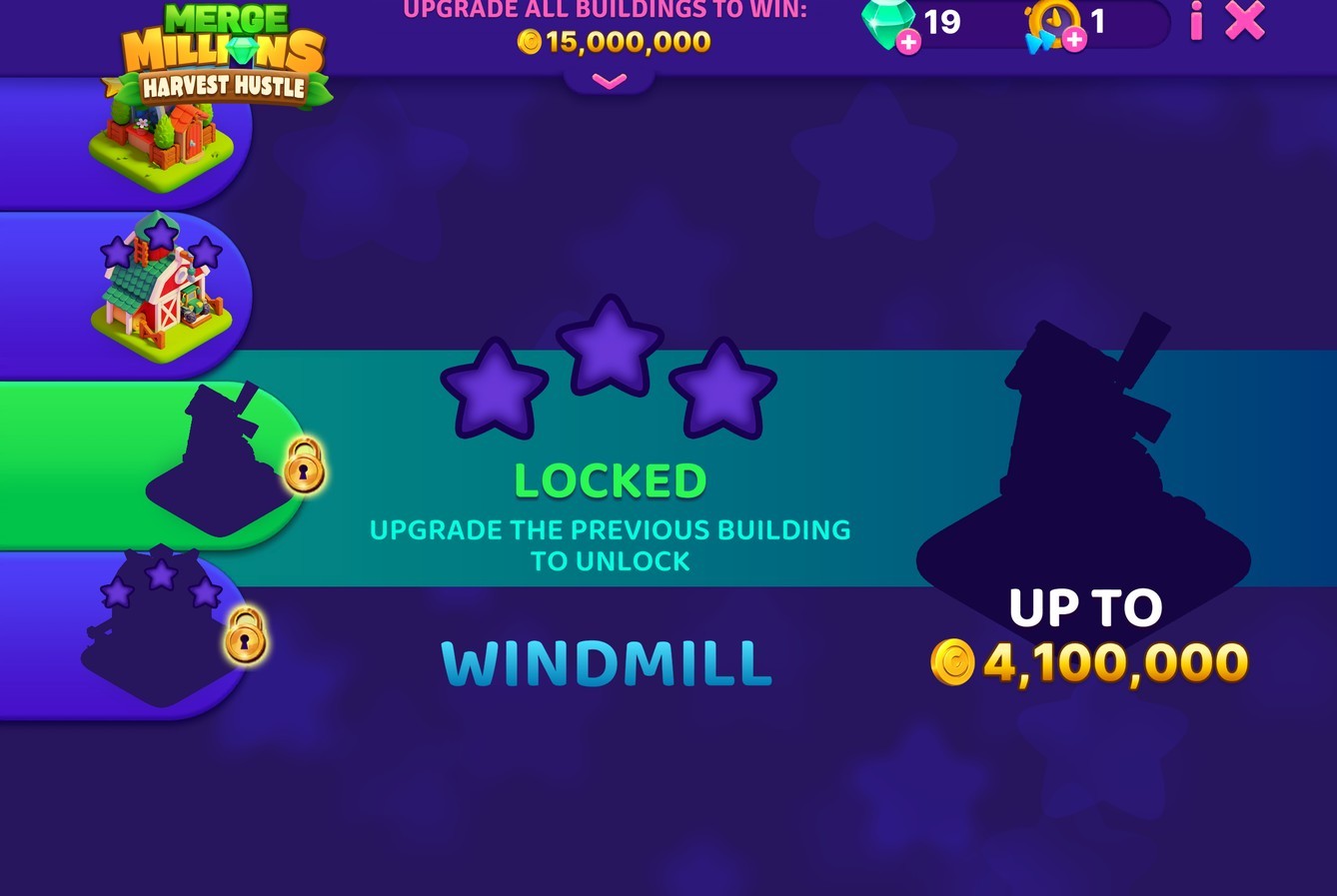
The sidebar, the key element, didn’t communicate progression: status, stars and unlock conditions were missing or unclear. Information sat in the wrong order. The building name lived at the bottom, and in testing people mistook it for the next building. Stars floated far from the building they belonged to. The timer, the single most important piece of information, was under-emphasized and styled differently from everywhere else. On top of that, scale and spacing were unbalanced and the logo sat outside its container, inconsistent with the rest of the game.
A Deeper, Structural Problem
Some issues couldn’t be fixed inside this screen, because they were caused by the screen existing at all.
Milestone rewards were hidden behind a tap-to-reveal and felt detached from the core loop. Building states went unnoticed. And the game kept pulling engaged players back here every time something changed. I flagged this as out of scope for the brief, and as the seed for a second, bolder direction.

Conservative Proposal
The direction the brief asked for: everything readable at a glance, nothing outside this screen touched.
Progression at a glance
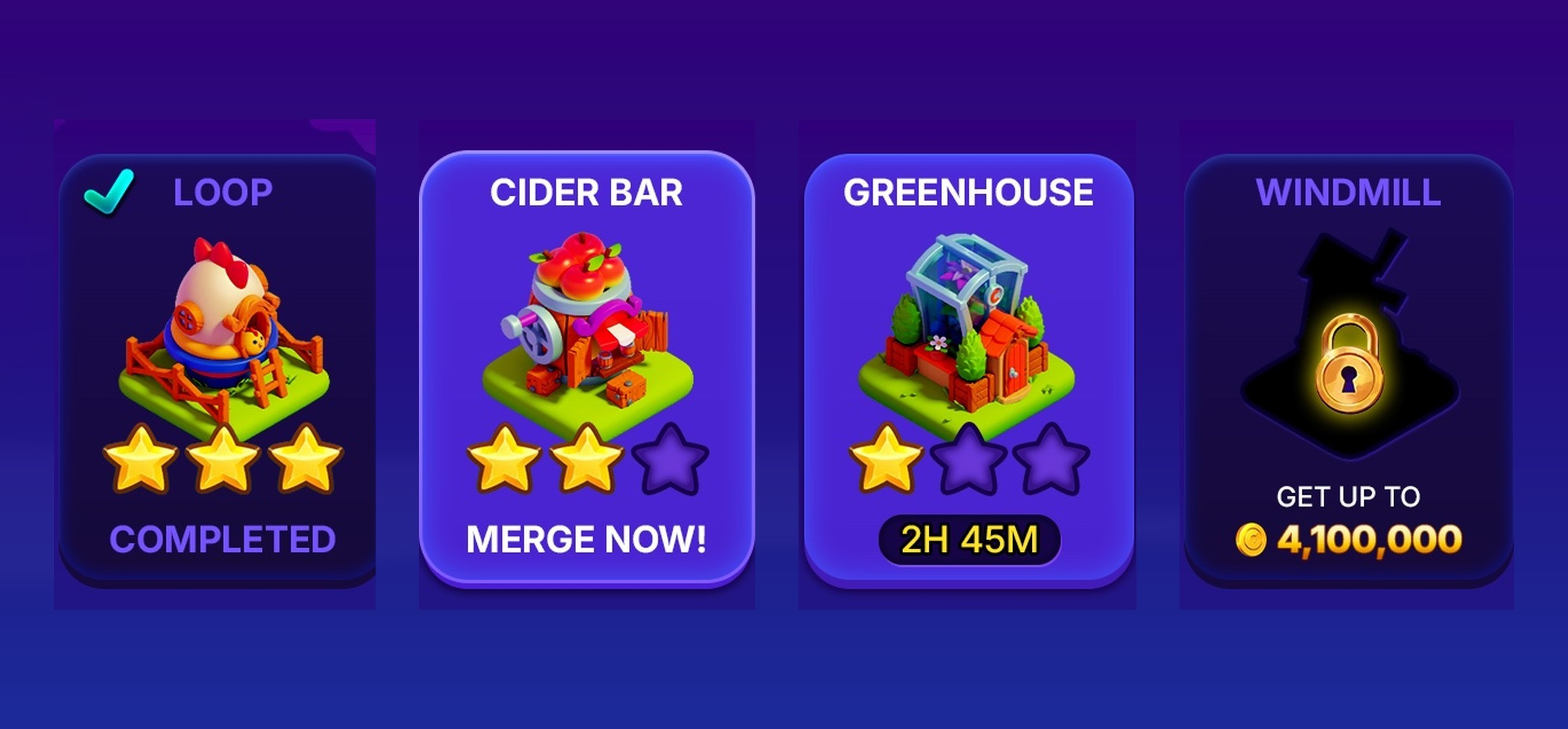
All seven buildings laid out together, each showing its own state at once, completed, ready to merge, on a timer, or locked with the reward it leads to. The full system now reads in a single look, and the milestone rewards moved into permanent view instead of hiding behind a tap.
Consistent by design
Fonts, icons and styles were preserved from the live feature, so no other screen needs to change to adopt it. The layout was then adapted across ratios, from 20:9 wide phones down to 4:3 tablets, with the header aligned to the gameplay screen.
Motion & Art Direction
Motion that communicates
Each building state got a defined feedback: a tooltip on locked boxes, a timer that hands off to a “Ready to Merge” call to action, and a full-box glow loop for the ready state. I also designed the unlock sequence that walks the player through earning the first star and opening the next building, from ghosted and locked to live and mergeable.
Direction for the art team
Standardizing the building bases exposed uneven scale and visual weight between them, so I set the fixes: rebalance the levels for contrast, improve separation inside each building with subtle light and shadow, and refine the icons toward a cleaner, flatter style consistent with gameplay.
Disruptive Proposal
The brief didn’t ask for this. But the real problem was the screen itself, so I designed the version that removes it.
The flow problem
Players are forced back to this screen to check status, and again after every new unlock. It feels intrusive, like losing control, and even then they still can’t see everything at once. For an engaged player it’s a recurring detour away from the game.
Keep it in the game
I moved building selection and detail into the gameplay view itself, selection on the left, detail on the right, laid out for two-handed play, so progression lives where the player already is. The separate screen disappears, but the core mechanics stay exactly the same and every UI style is taken straight from the portal.
Designed around progression
The feature is progression all the way down: merge to earn stars, stars to upgrade buildings, complete all buildings to unlock the top rewards. The layout makes each of those layers visible and links them together, so the player always understands where they are and what comes next.

Team & Timeline
An Art Lead ships through a team, so half the challenge is organizing one.
The team
1 UX, 1 UI, 1 Game Artist, 1 Animator, all starting in parallel from a shared kick-off.
The plan
UX defines the player journey and corner cases and validates real understanding of progression, states and rewards early. UI designs the states and calls to action and ensures the screen holds up across ratios and devices. Art rebalances the buildings and prepares assets, handling the ones with dependencies. Animation covers the microinteractions and the system-driven states: unlocks, merge-ready, timer end.
Handling the risk
UX changes can ripple into rework, especially early, so the sequencing is built to minimize that and the dependencies are aligned at the kick-off. A retrospective at the end closes the loop and feeds the next iteration.
What This Was Really About
On paper it was a single screen of UI polish.
Treated as a system to explain, a flow to protect, and a team to organize, it becomes product work. The conservative direction respects the constraints and could ship as-is. The disruptive one shows where the feature could go if the constraints were lifted. Both are built on the same reading of the player.
More Works
©2026

2025
Merge Millions
Redesigning the building-selection screen of Harvest Hustle, a merge-collection feature inside Cashman Casino.
UX Analysis
UI Design
Design Leadership
Product Overview
“One screen was carrying the entire progression of a merge feature, and players couldn’t read it at a glance.
The challenge was to make the whole system obvious without breaking anything that already worked.”
Craft, clarity, and a plan to ship it
Merge Millions brings casual merge-collection mechanics to the social casino genre. Players merge items to earn stars, stars upgrade buildings, and completing every building unlocks the big milestone rewards. The building selection screen is where players are supposed to read that whole system at once, seven buildings, three star levels each, and know exactly what to do next.
The brief asked for three things: analyze this screen, deliver a polished redesign in the exact visual style of the feature, and plan the team and timeline to build it. I approached it the way a lead does. Diagnose first, then propose, then organize the work to get it made.
0+
0+
Screens Studied
Mapping the Live Feature
0
0
Progression States
7 buildings across 3 star levels
0
0
Roles Orchestrated
UX, UI, Game Artist, Animator
Screen Analysis
Before touching pixels, I mapped what the screen has to do, then every place it fails to do it.
Three jobs, one screen
The screen has to show the system overview, seven buildings by three star levels, always visible and consistent. It has to guide progression, the current status of each building and the exact condition to unlock the next one, with no ambiguity. And it has to motivate, surfacing the milestone prizes for completing everything as a reason to keep going.
Where the hierarchy breaks
The sidebar, the key element, didn’t communicate progression: status, stars and unlock conditions were missing or unclear. Information sat in the wrong order. The building name lived at the bottom, and in testing people mistook it for the next building. Stars floated far from the building they belonged to. The timer, the single most important piece of information, was under-emphasized and styled differently from everywhere else. On top of that, scale and spacing were unbalanced and the logo sat outside its container, inconsistent with the rest of the game.
A Deeper, Structural Problem
Some issues couldn’t be fixed inside this screen, because they were caused by the screen existing at all.
Milestone rewards were hidden behind a tap-to-reveal and felt detached from the core loop. Building states went unnoticed. And the game kept pulling engaged players back here every time something changed. I flagged this as out of scope for the brief, and as the seed for a second, bolder direction.
Conservative Proposal
The direction the brief asked for: everything readable at a glance, nothing outside this screen touched.
Progression at a glance
All seven buildings laid out together, each showing its own state at once, completed, ready to merge, on a timer, or locked with the reward it leads to. The full system now reads in a single look, and the milestone rewards moved into permanent view instead of hiding behind a tap.
Consistent by design
Fonts, icons and styles were preserved from the live feature, so no other screen needs to change to adopt it. The layout was then adapted across ratios, from 20:9 wide phones down to 4:3 tablets, with the header aligned to the gameplay screen.
Motion & Art Direction
Motion that communicates
Each building state got a defined feedback: a tooltip on locked boxes, a timer that hands off to a “Ready to Merge” call to action, and a full-box glow loop for the ready state. I also designed the unlock sequence that walks the player through earning the first star and opening the next building, from ghosted and locked to live and mergeable.
Direction for the art team
Standardizing the building bases exposed uneven scale and visual weight between them, so I set the fixes: rebalance the levels for contrast, improve separation inside each building with subtle light and shadow, and refine the icons toward a cleaner, flatter style consistent with gameplay.
Disruptive Proposal
The brief didn’t ask for this. But the real problem was the screen itself, so I designed the version that removes it.
The flow problem
Players are forced back to this screen to check status, and again after every new unlock. It feels intrusive, like losing control, and even then they still can’t see everything at once. For an engaged player it’s a recurring detour away from the game.
Keep it in the game
I moved building selection and detail into the gameplay view itself, selection on the left, detail on the right, laid out for two-handed play, so progression lives where the player already is. The separate screen disappears, but the core mechanics stay exactly the same and every UI style is taken straight from the portal.
Designed around progression
The feature is progression all the way down: merge to earn stars, stars to upgrade buildings, complete all buildings to unlock the top rewards. The layout makes each of those layers visible and links them together, so the player always understands where they are and what comes next.
Team & Timeline
An Art Lead ships through a team, so half the challenge is organizing one.
The team
1 UX, 1 UI, 1 Game Artist, 1 Animator, all starting in parallel from a shared kick-off.
The plan
UX defines the player journey and corner cases and validates real understanding of progression, states and rewards early. UI designs the states and calls to action and ensures the screen holds up across ratios and devices. Art rebalances the buildings and prepares assets, handling the ones with dependencies. Animation covers the microinteractions and the system-driven states: unlocks, merge-ready, timer end.
Handling the risk
UX changes can ripple into rework, especially early, so the sequencing is built to minimize that and the dependencies are aligned at the kick-off. A retrospective at the end closes the loop and feeds the next iteration.
What This Was Really About
On paper it was a single screen of UI polish.
Treated as a system to explain, a flow to protect, and a team to organize, it becomes product work. The conservative direction respects the constraints and could ship as-is. The disruptive one shows where the feature could go if the constraints were lifted. Both are built on the same reading of the player.
More Works
©2026
2025
Merge Millions
Redesigning the building-selection screen of Harvest Hustle, a merge-collection feature inside Cashman Casino.
UX Analysis
UI Design
Design Leadership
Product Overview
“One screen was carrying the entire progression of a merge feature, and players couldn’t read it at a glance.
The challenge was to make the whole system obvious without breaking anything that already worked.”
Craft, clarity, and a plan to ship it
Merge Millions brings casual merge-collection mechanics to the social casino genre. Players merge items to earn stars, stars upgrade buildings, and completing every building unlocks the big milestone rewards. The building selection screen is where players are supposed to read that whole system at once, seven buildings, three star levels each, and know exactly what to do next.
The brief asked for three things: analyze this screen, deliver a polished redesign in the exact visual style of the feature, and plan the team and timeline to build it. I approached it the way a lead does. Diagnose first, then propose, then organize the work to get it made.
0+
0+
Screens Studied
Mapping the Live Feature
0
0
Progression States
7 buildings across 3 star levels
0
0
Roles Orchestrated
UX, UI, Game Artist, Animator
Screen Analysis
Before touching pixels, I mapped what the screen has to do, then every place it fails to do it.
Three jobs, one screen
The screen has to show the system overview, seven buildings by three star levels, always visible and consistent. It has to guide progression, the current status of each building and the exact condition to unlock the next one, with no ambiguity. And it has to motivate, surfacing the milestone prizes for completing everything as a reason to keep going.
Where the hierarchy breaks
The sidebar, the key element, didn’t communicate progression: status, stars and unlock conditions were missing or unclear. Information sat in the wrong order. The building name lived at the bottom, and in testing people mistook it for the next building. Stars floated far from the building they belonged to. The timer, the single most important piece of information, was under-emphasized and styled differently from everywhere else. On top of that, scale and spacing were unbalanced and the logo sat outside its container, inconsistent with the rest of the game.
A Deeper, Structural Problem
Some issues couldn’t be fixed inside this screen, because they were caused by the screen existing at all.
Milestone rewards were hidden behind a tap-to-reveal and felt detached from the core loop. Building states went unnoticed. And the game kept pulling engaged players back here every time something changed. I flagged this as out of scope for the brief, and as the seed for a second, bolder direction.
Conservative Proposal
The direction the brief asked for: everything readable at a glance, nothing outside this screen touched.
Progression at a glance
All seven buildings laid out together, each showing its own state at once, completed, ready to merge, on a timer, or locked with the reward it leads to. The full system now reads in a single look, and the milestone rewards moved into permanent view instead of hiding behind a tap.
Consistent by design
Fonts, icons and styles were preserved from the live feature, so no other screen needs to change to adopt it. The layout was then adapted across ratios, from 20:9 wide phones down to 4:3 tablets, with the header aligned to the gameplay screen.
Motion & Art Direction
Motion that communicates
Each building state got a defined feedback: a tooltip on locked boxes, a timer that hands off to a “Ready to Merge” call to action, and a full-box glow loop for the ready state. I also designed the unlock sequence that walks the player through earning the first star and opening the next building, from ghosted and locked to live and mergeable.
Direction for the art team
Standardizing the building bases exposed uneven scale and visual weight between them, so I set the fixes: rebalance the levels for contrast, improve separation inside each building with subtle light and shadow, and refine the icons toward a cleaner, flatter style consistent with gameplay.
Disruptive Proposal
The brief didn’t ask for this. But the real problem was the screen itself, so I designed the version that removes it.
The flow problem
Players are forced back to this screen to check status, and again after every new unlock. It feels intrusive, like losing control, and even then they still can’t see everything at once. For an engaged player it’s a recurring detour away from the game.
Keep it in the game
I moved building selection and detail into the gameplay view itself, selection on the left, detail on the right, laid out for two-handed play, so progression lives where the player already is. The separate screen disappears, but the core mechanics stay exactly the same and every UI style is taken straight from the portal.
Designed around progression
The feature is progression all the way down: merge to earn stars, stars to upgrade buildings, complete all buildings to unlock the top rewards. The layout makes each of those layers visible and links them together, so the player always understands where they are and what comes next.
Team & Timeline
An Art Lead ships through a team, so half the challenge is organizing one.
The team
1 UX, 1 UI, 1 Game Artist, 1 Animator, all starting in parallel from a shared kick-off.
The plan
UX defines the player journey and corner cases and validates real understanding of progression, states and rewards early. UI designs the states and calls to action and ensures the screen holds up across ratios and devices. Art rebalances the buildings and prepares assets, handling the ones with dependencies. Animation covers the microinteractions and the system-driven states: unlocks, merge-ready, timer end.
Handling the risk
UX changes can ripple into rework, especially early, so the sequencing is built to minimize that and the dependencies are aligned at the kick-off. A retrospective at the end closes the loop and feeds the next iteration.
What This Was Really About
On paper it was a single screen of UI polish.
Treated as a system to explain, a flow to protect, and a team to organize, it becomes product work. The conservative direction respects the constraints and could ship as-is. The disruptive one shows where the feature could go if the constraints were lifted. Both are built on the same reading of the player.
More Works
©2026